Browsing the Library
Once your scan has landed, the sidebar is your map. This page tours each library type and the navigation conventions they share.
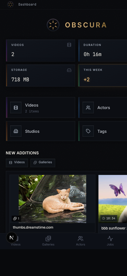
The dashboard (/)
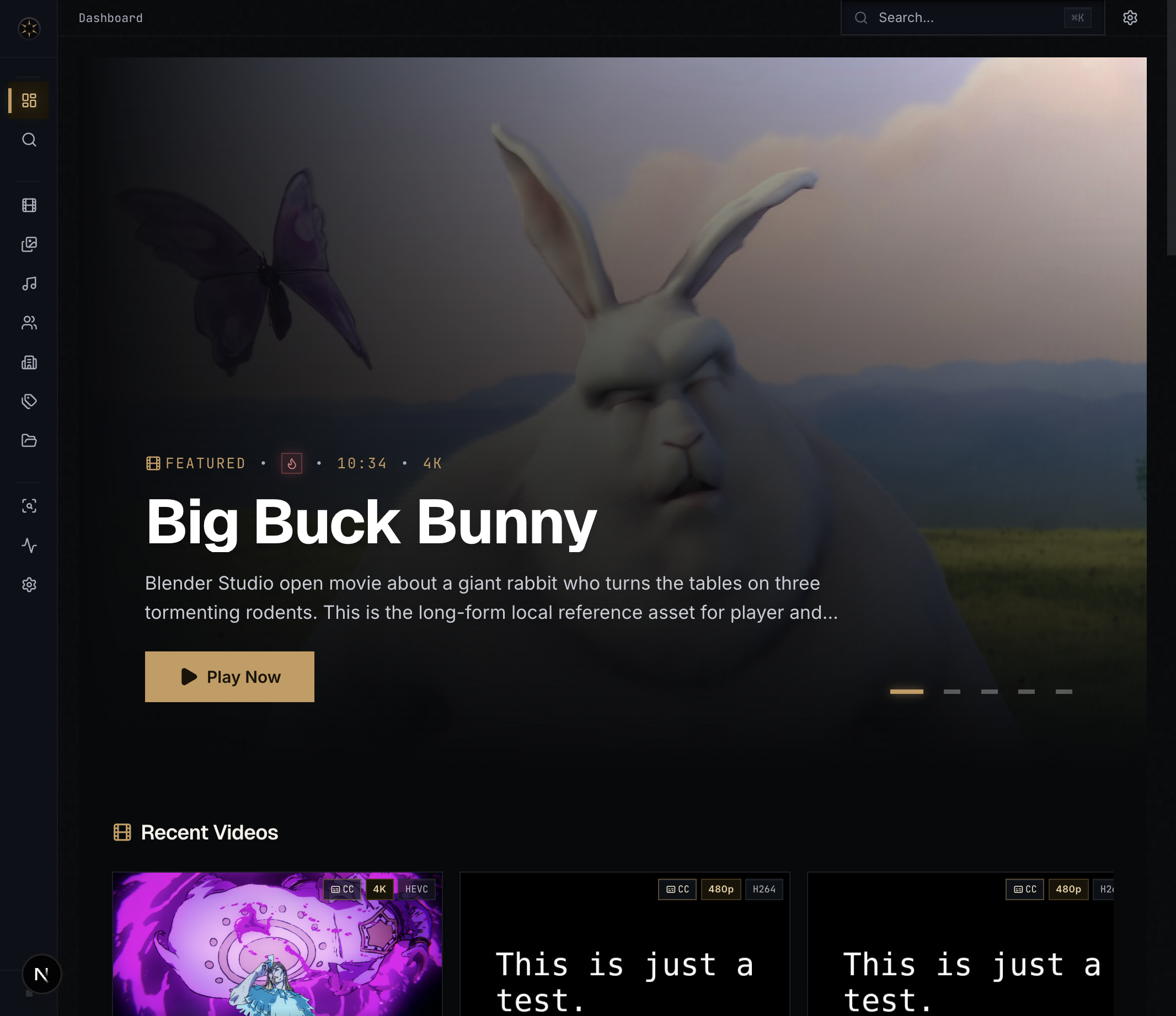
The dashboard is a cinematic landing page:
- Featured carousel — rotates through highlighted videos every 8 seconds, weighted toward top-rated and recently-played items. Click Play now to jump straight into playback.
- Recent additions — horizontal scroll-snap rows for Videos, Galleries, Images, Audio, Series, Performers, and Studios. Each row reflects what's new since your last visit.
NSFW content respects your current visibility mode (see Settings). On a fresh install with no content the dashboard shows an empty state pointing at Settings.
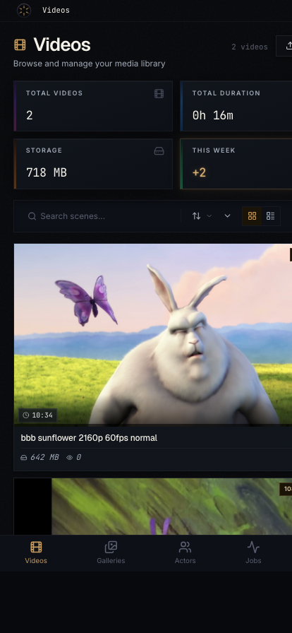
Videos (/videos)
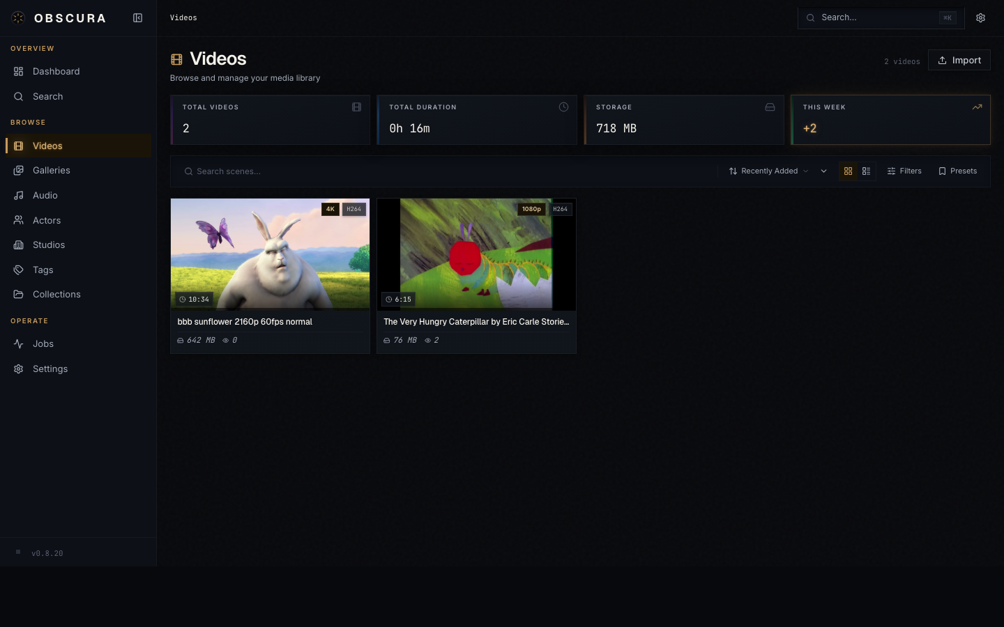
The videos page is a filterable, sortable grid. The same control set appears on every list page in Obscura — once you learn it here, it carries.
Top bar:
- Search — debounced 300 ms, hits the title, original title, performers, tags, and details
- Sort dropdown — Recently Added (default), Title, Date, Duration, File Size, Rating, Most Played
- View toggle — Grid ↔ List
- Thumbnail size slider — adjusts grid column count (5 by default)
- Filter preset menu — save / load / reset combinations of filters
Filter sidebar:
- Rating (0–5 stars)
- Date range
- Library flags (organized, has subtitles)
- Tags (multi-select)
- Performers (multi-select)
- Studios (single select)
Cards show a thumbnail, title, duration, resolution, file size, and rating. Hover to scrub through trickplay sprites if generation has completed.
All of these preferences are persisted server-side in the ui_prefs table — they follow you across browsers and devices, not just one laptop.
Series (/series)
Series live in their own page because they're hierarchical: a series contains seasons, which contain episodes.
The page navigates in three views:
- Series grid — all series, sortable by title / recent / date / rating / video count
- Season grid — one series selected, showing its seasons
- Episode list — one season selected, showing episodes in order
Breadcrumbs at the top let you jump back up the tree. Episodes show S01E03 badges where season + episode numbers were parsed.
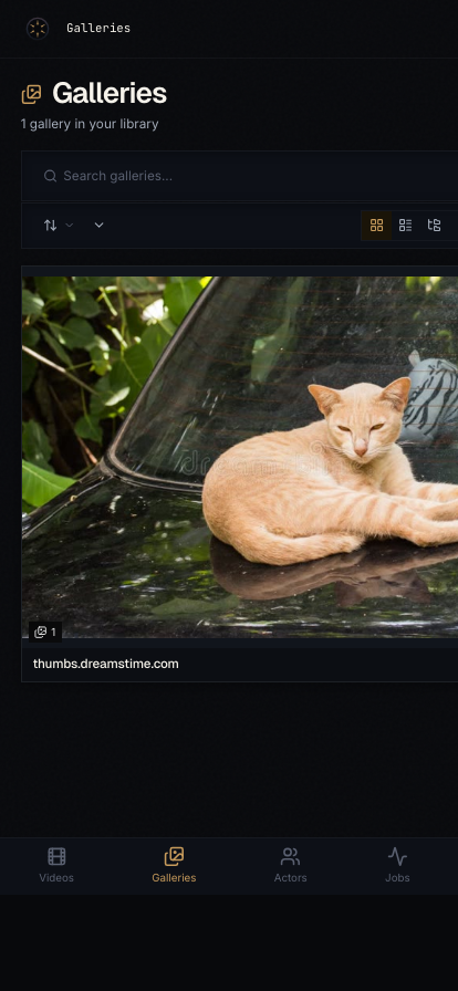
Galleries (/galleries) and Images (/images)
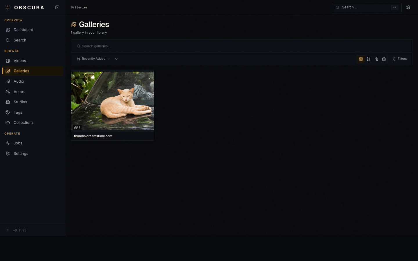
Galleries are rendered as cards with a multi-image preview cover. Click into a gallery to see its images in a masonry layout that respects each image's natural aspect ratio.
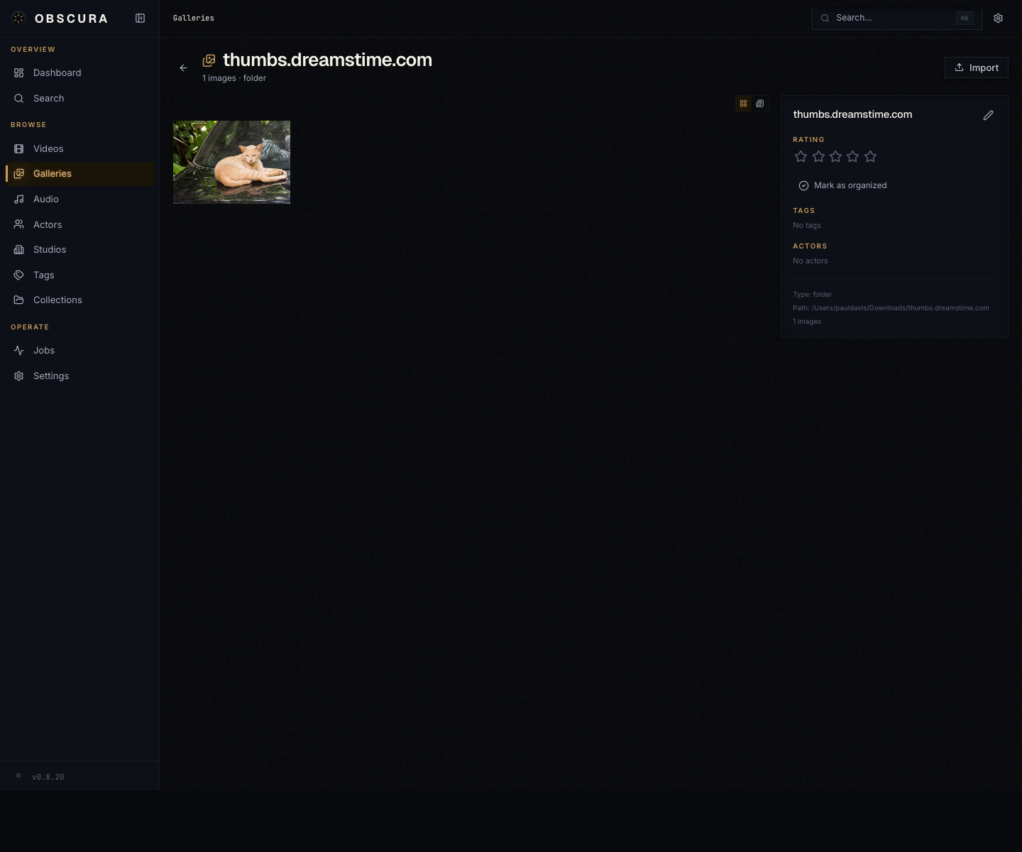
The standalone Images page covers loose images that aren't part of a folder gallery. Clicking either opens the lightbox, covered fully in Playback.
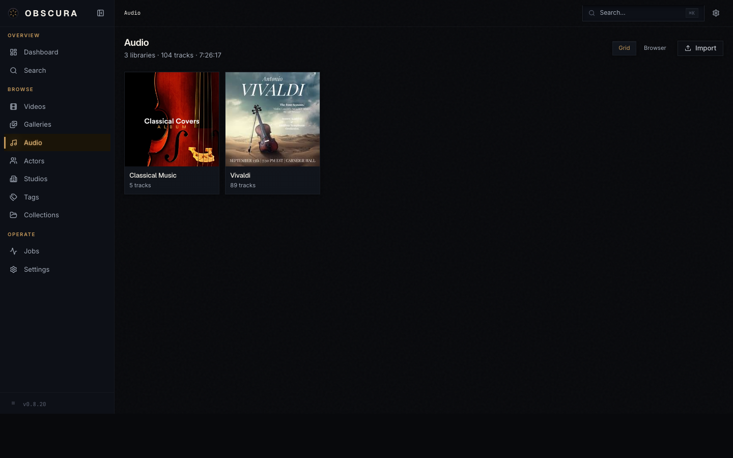
Audio (/audio)
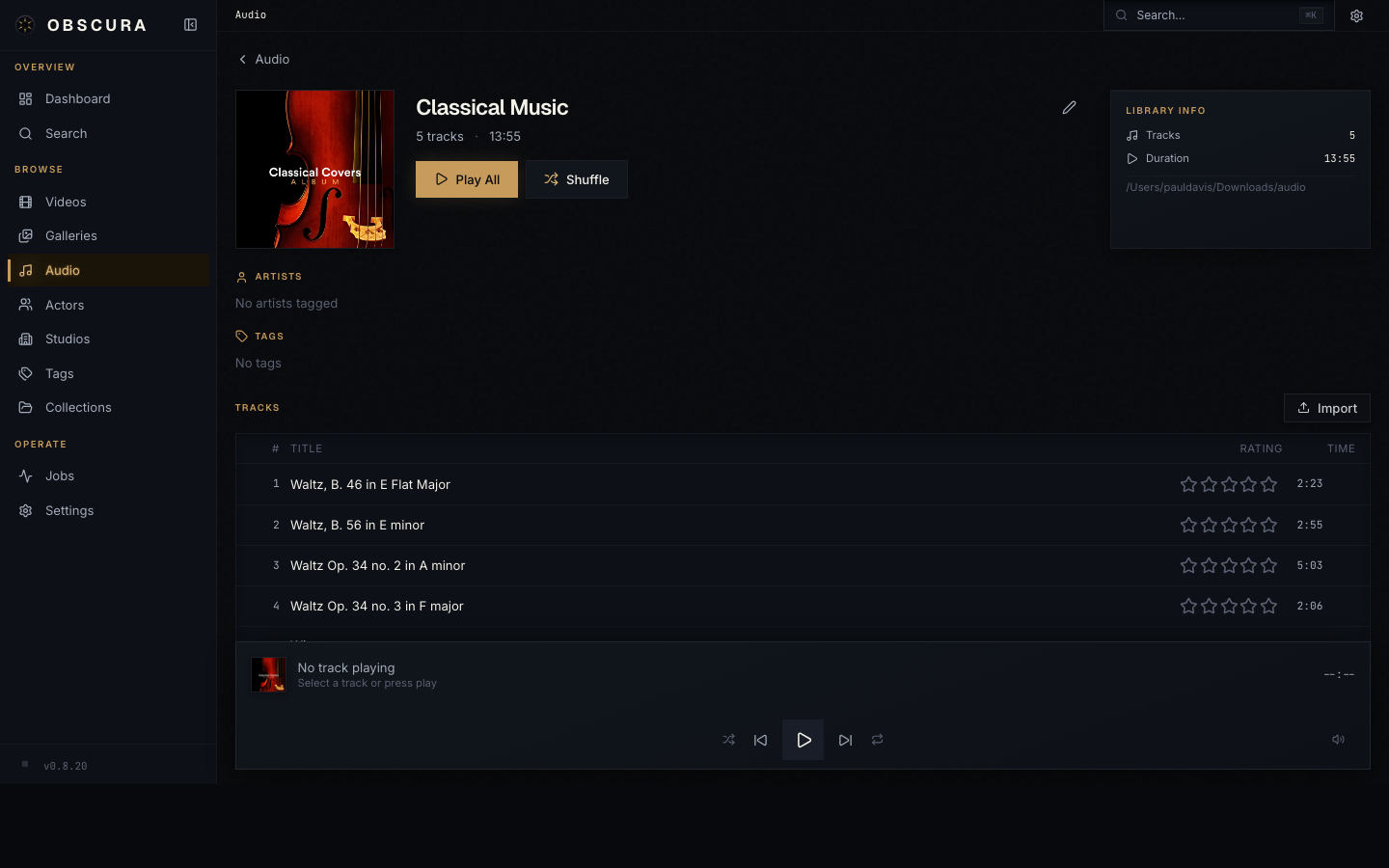
Audio libraries are the album-equivalent: a folder of tracks. Each library card shows cover art, title, and track count.
Inside a library, the playlist component takes over. The brass-accent active row marks the current track; a live equalizer animation runs while it plays. The bottom-of-screen player handles playback globally so navigating away doesn't interrupt the audio.
The bottom player gives you:
- Play / Pause, Previous / Next
- Shuffle and loop toggles
- Time display + scrubber
- Volume slider
- Playback speed (0.75×–2×)
Performers, Studios, Tags
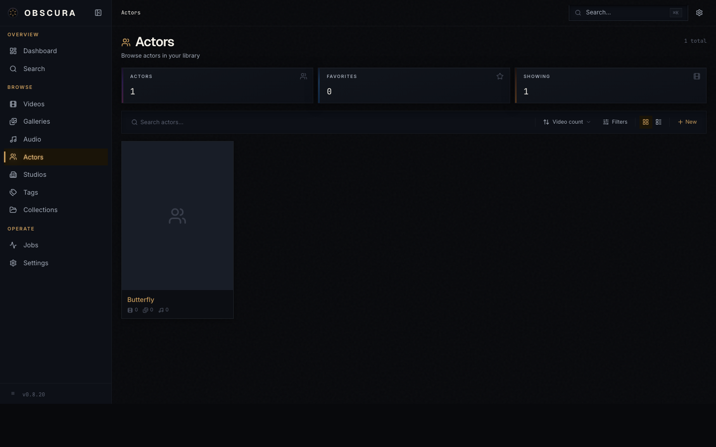
The taxonomy pages all follow the same shape: a sortable grid of cards on the index page, a detail page with appearance counts and content tabs.
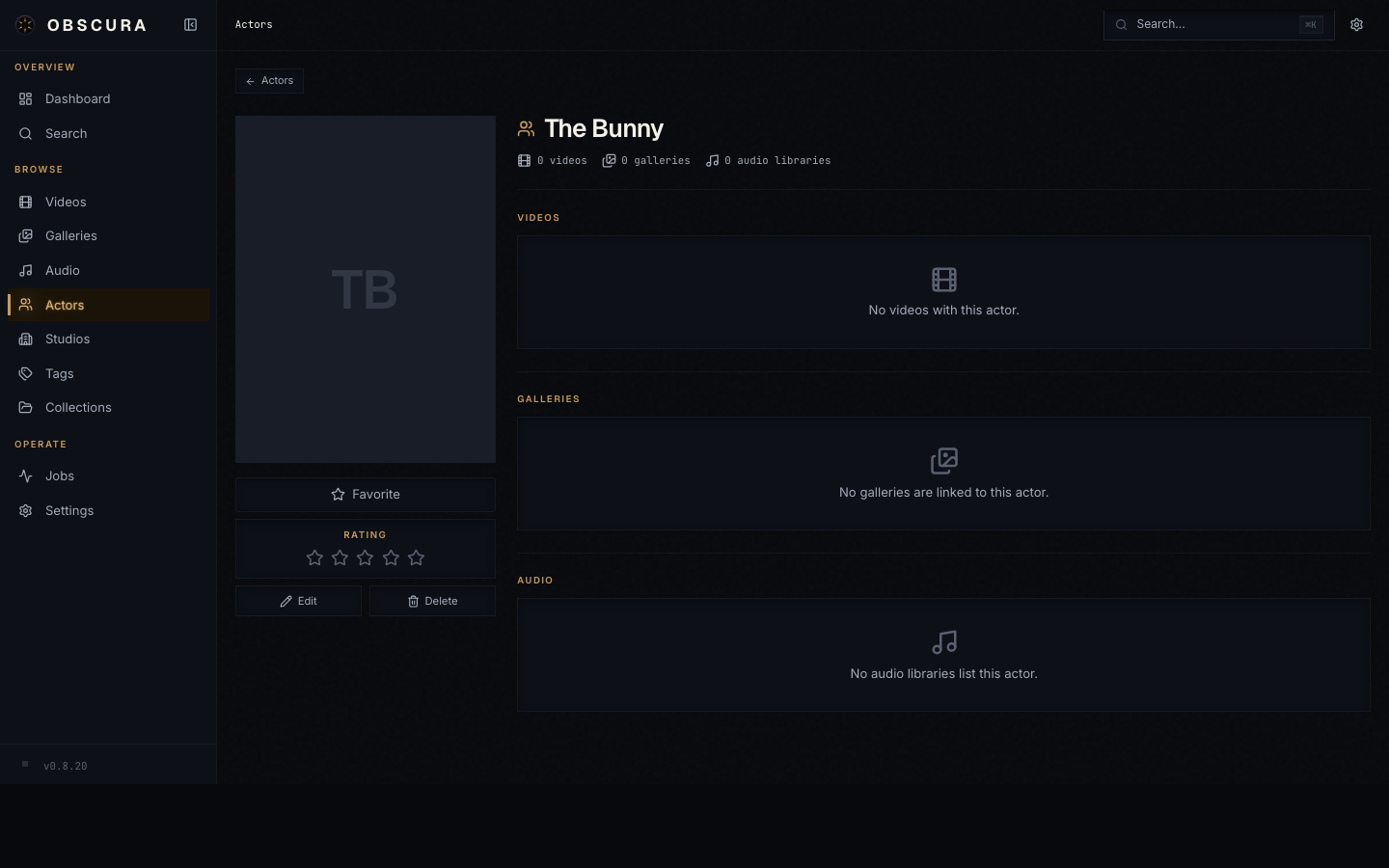
A performer detail page shows:
- Photo, name, aliases, birthdate, country, gender, rating
- Editable bio
- Known For — top movies, series, and unique episode roles with character names
- Cross-media tabs — every video, series, gallery, image, and audio library this performer appears in
Studios and tags work the same way, with the appearance counts that make sense for each.
Collections (/collections)
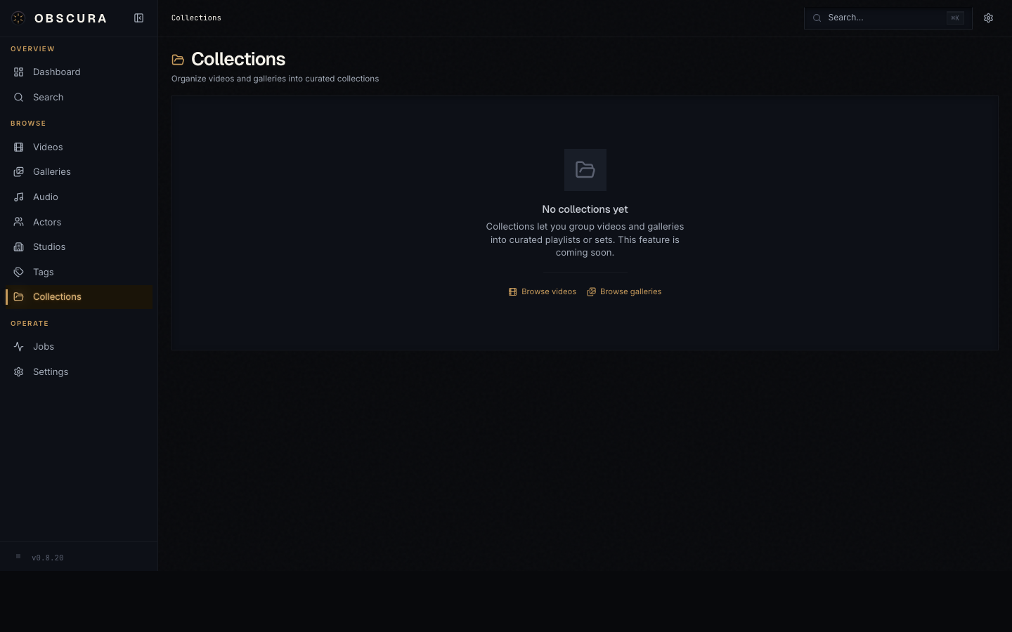
Collections are user-created groupings that span media types. Three modes:
| Mode | What it does |
|---|---|
| Manual | You add and remove items individually. |
| Dynamic | A rule tree (e.g. "all videos with tag 'favorite' rated 4+") evaluated on demand. |
| Hybrid | Dynamic base + manual additions / removals. |
A collection detail page lets you toggle between Mixed (everything in one view) and By type (tabs per media type). You can play a collection as a slideshow with auto-advance — useful for galleries or audio playlists.
Search and the command palette
There are two ways to search.
Global search page (/search)
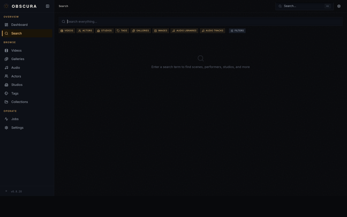
The search page is the deep version. Type a query, toggle which entity kinds to include (Videos, Series, Galleries, Images, Performers, Studios, Tags, Audio), and optionally narrow by rating or date range. Results are grouped per kind with a Load more button when there are more than six matches.
URL state syncs both ways — ?q=blade&kinds=video,movie&minRating=3 is shareable.
Command palette (Cmd+K / Ctrl+K)
The palette is the quick version. It pops over wherever you are in the app, runs a debounced search after two characters, and groups results the same way. Enter on a result navigates to it; Enter with no result selected opens the full search page with your current query.
Recent searches are remembered (the last ten, in localStorage) so the palette is also a "where was that thing I was looking at" history.
Keyboard shortcuts (global)
| Shortcut | Action |
|---|---|
Cmd+K / Ctrl+K | Open command palette |
Cmd+Shift+Z / Ctrl+Shift+Z | Toggle NSFW visibility (Show ↔ Off) |
Per-feature shortcuts (video player, image lightbox) are listed in Playback.
Mobile navigation
Obscura is designed mobile-first. On phones, the sidebar collapses into a hamburger and the bottom of the screen becomes the mobile nav with thumb-zone access to the main library types.
Sheets and drawers animate in from the bottom edge; image lightboxes support swipe navigation; everything reachable from a tap, never hover-only.